The first of April means the start of something magical to many, and I’m not just talking wood frogs and practical jokes. It’s Opening Day, the start of baseball season in America. A day when our nation’s pastime and my personal pastime collide. I love baseball and I love maps. This time of year, I often find myself sitting at my desk daydreaming about ballgames, schedules, lineups and stats when I should be more focused on my daily tasks (don’t tell Chet!). In order to feel more (or less?) productive, I spent a little time bringing my two loves together. Without further ado, I present to you a collection of the best baseball related cartography on the web. Click on any of the images below for a closer look. Enjoy and play ball!
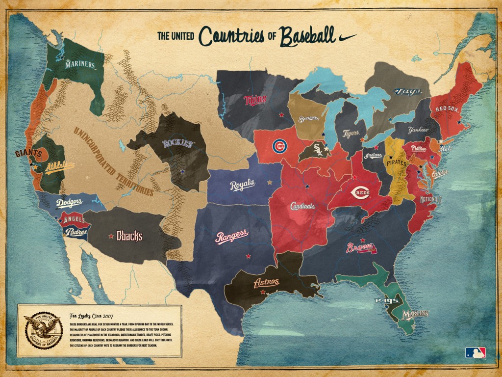
The United Countries of Baseball
This popular map was created by Nike as a promotional campaign in 2007. It takes a look at the supposed territories of the National and American leagues based on fan loyalty. Personally, I’m not sure I agree with their assessment of Connecticut. I’d say it’s pretty evenly divided between Yankee and Red Sox fans. Go Yanks!
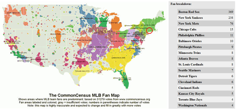
The Common Census Baseball Fan Loyalty Map
The Common Census Map Project also tries to map fan loyalty, this time using crowd sourcing. The map provides a breakdown of team preference based on geographic location and user input. The project currently has over 31,000 fan votes and is growing. Stats shown on the right are for a 100 mile fan base as depicted by the red circle over Connecticut. Click on the map for a closer look.
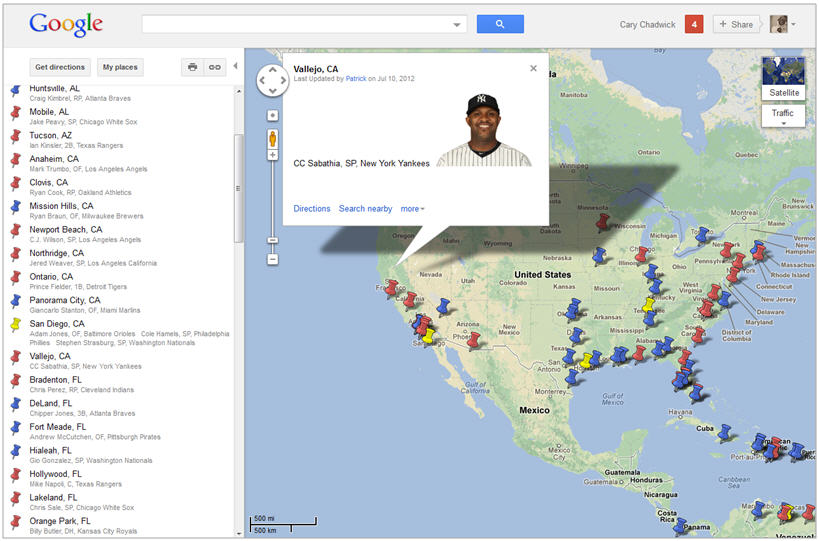
MLB All-Star Origin Google Map
Patrick Dorsey of ESPN.com created a Google Map showing the birthplace of all 74 of the 2012 Major League Baseball All-Star players.
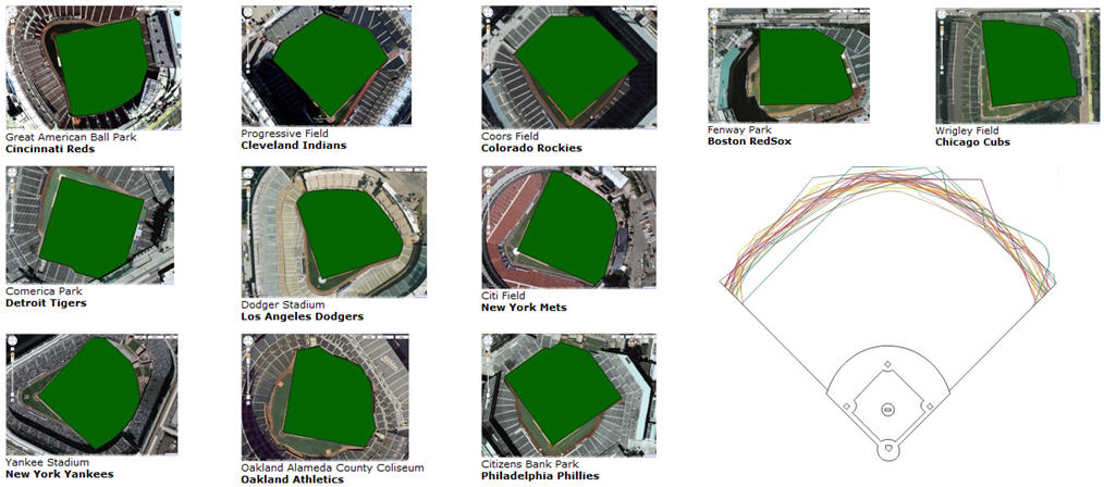
Google Imagery Highlights Diversity of Major League Baseball Fields
The outfields of Major League parks vary dramatically. Check out this overlay comparison done by Snippets.com using Google Maps aerial imagery.
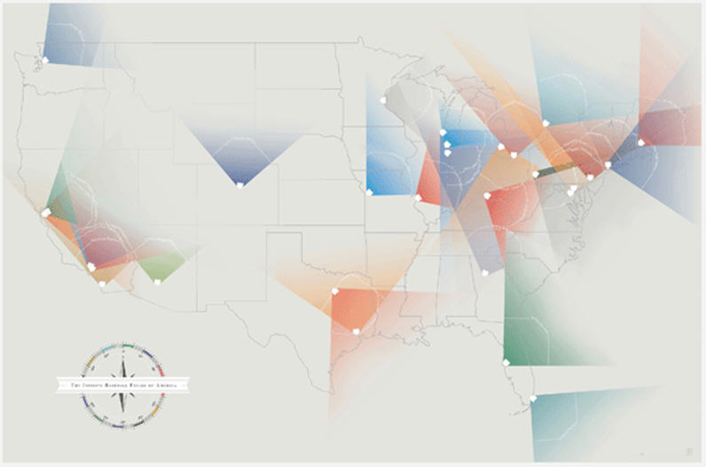
Infinite Baseball Fields of America
This final map by Pop Chart Lab is my favorite. It shows “infinite” foul lines for each Major League baseball park in America. Playing off the concept that there is no explicit rule in baseball that foul lines end at the outfield fence, these foul lines run until there’s nowhere left to go.